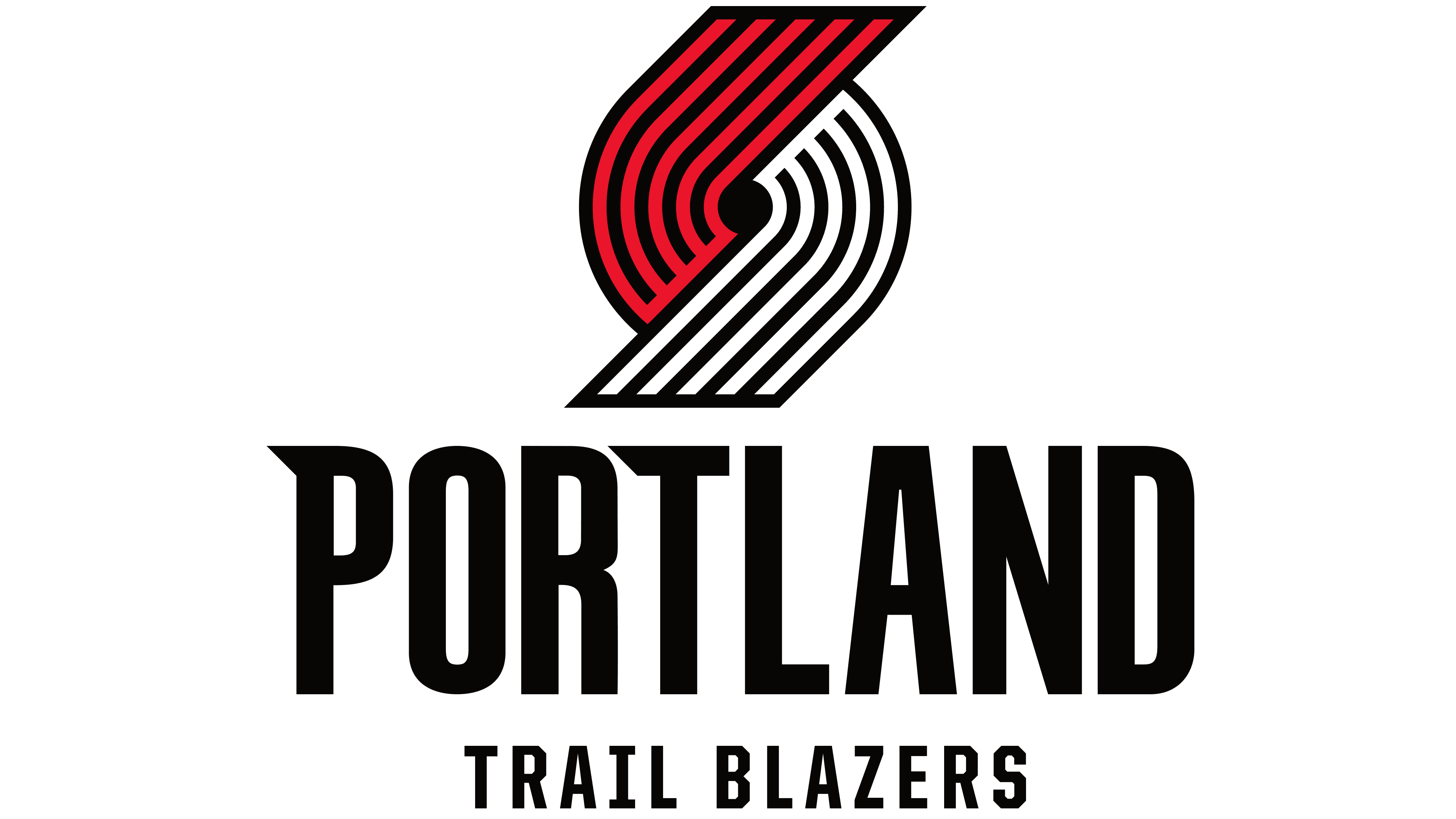
After an upsetting loss to the Golden State Warriors in the Western Conference quarterfinals, the Portland Trail Blazers have decided to unveil a fresh, new look for the coming year. The purpose behind the logo is to help the team gear up for the 2017-18 NBA season with a clean slate.
If you are not familiar with logo design, the new logo might not look all that different from the team’s previous designs. However, if you really look at the design, you will notice that the update is subtle, modern, and it still is in-line with the team’s traditional look.

Logo Design
Make Your Brand Front-of-Mind
Your logo delivers the promise of quality and value that your company has established. Whether you are a new company yet to develop a logo or an existing one in need of something new, Kraus has you covered.

Now that you had a chance to look at the logo, you might be wondering what the history behind it is. When the team was founded in 1970, the vice president held a contest for fans to submit name ideas. Blake Byrne crafted the name, “Trail Blazers” and was picked at random from the 172 other people who had thought of the same name.
We are a full-service digital marketing agency looking to take your campaign or project from concept to finished product, assuring no detail is overlooked along the way.
Once the team had a name created, the logo, a pinwheel, was designed. If you aren’t a basketball fanatic, you will not understand the significance of the design. It is not just a pinwheel. The logo signifies the five offensive players and five defenders joining to play basketball. The curve in the lines represents the fast-pace movement of the game.
Some of the updates of the new logo include:
- The lines are now connected by following the same trail to reach the center of the pinwheel. This represents teamwork.
- Honors the original logo that was made with evenly spaced lines and congruent edges.
- Pays homage to Portland and its surrounding community as the angles of the lines are at 45 degrees. This signifies the 45th Parallel North that leads people to the Northwest region of America.
- Pulls from the 90s brand as the colors are flopped to bring red on top.
- Updated font to provide a modern look to the brand.
Do you want to revamp your branding? Kraus Marketing specializes in corporate branding. We conduct in-depth interviews to understand your company. Afterwards, our team of creative designers and copywriters work to create a brand that represents the direction you want your company to go in. Contact our team for more information.

