Serif vs. Sans Serif: A Timeline of Popularity
The serif vs. sans serif debate has been around for a long time. There are proponents of both styles and those who think that one style is better than the other. However, the popularity of serif vs. sans serif typefaces has ebbed and flowed over the years.
In the early days of printing, serif typefaces were the norm. This was because they were easier to read in print. However, as technology progressed and screens became more common, sans serif typefaces became the more popular choice because it’s easier to read on screens.
The popularity of serif vs. sans serif typefaces has fluctuated over the years, but it seems that sans serif typefaces have dominated the marketing world for the last decade or so. This is likely since this typeface appears more modern. However, serif typefaces still have their place, and many believe they are more aesthetically pleasing.
About Us
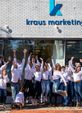
Full-Service Marketing Agency
We are a full-service digital marketing agency looking to take your campaign or project from concept to finished product, assuring no detail is overlooked along the way.
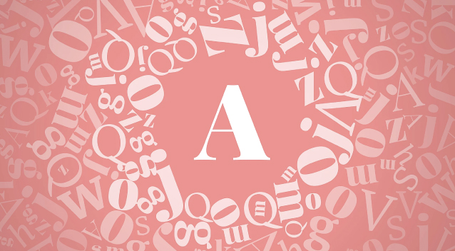
What is the Difference Between Serif vs. Sans Serif
Serif typefaces have small lines at the end of each letter, while sans serif typefaces do not. This makes serif typefaces more challenging to read on screens, but they look classic and are aesthetically pleasing. Sans serif typefaces are easier to read on screens, but they can look dated or generic. However, in 2022, it appears that serif is back and being used more to infuse charm, elegance, and sophistication into a brand.
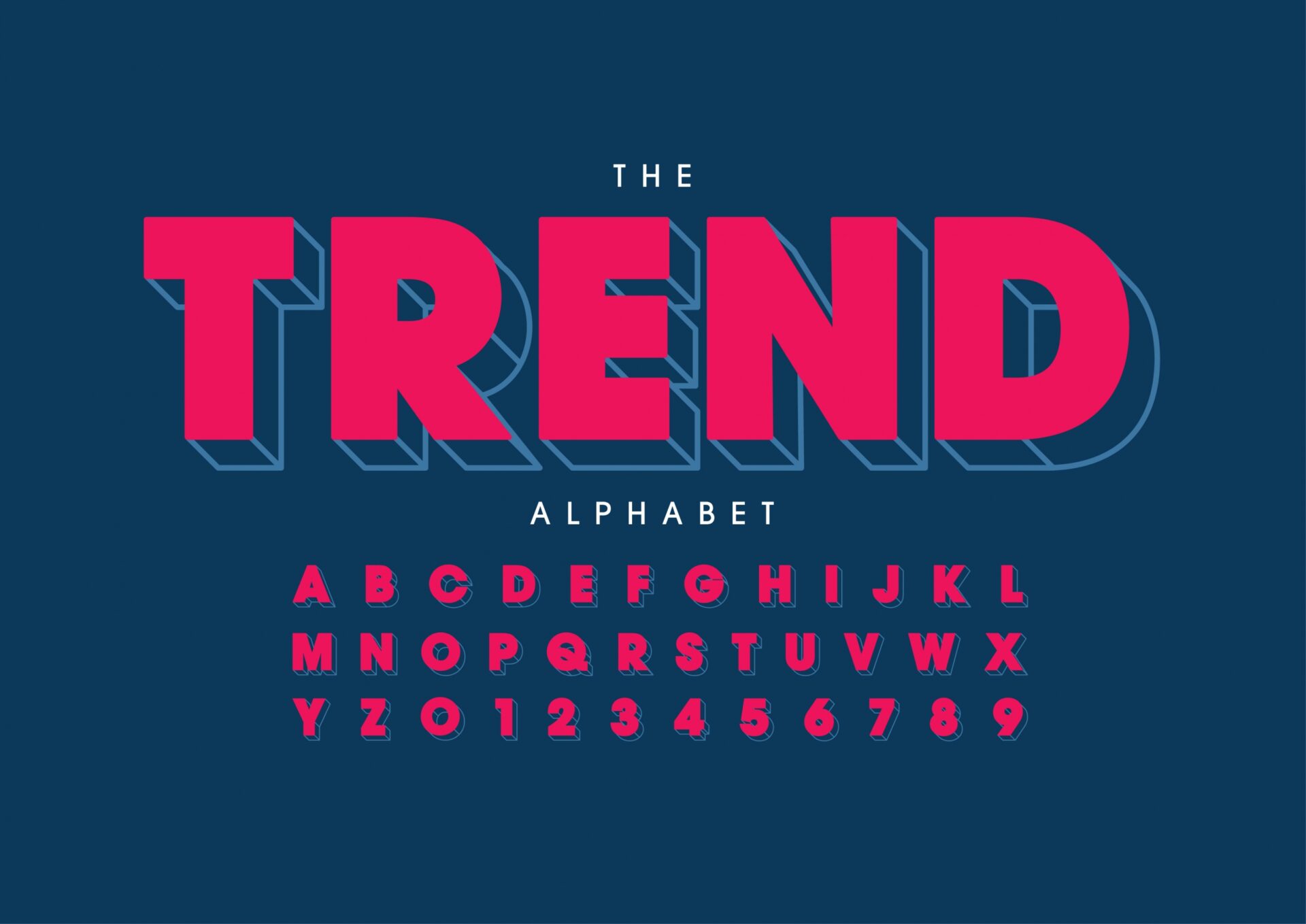
Vector of stylized modern font and alphabet
With the more widespread use of serif fonts in 2022 comes the rise of experimental typography. Serifs are now being appreciated for their extending features and have been taken to new levels of expression to showcase unique brand personalities.
Experimental Typography and Branding
Experimental typography is the creation of a typeface that is not constrained by the traditional rules of typography. Marketers and graphic designers are constantly pushing the boundaries and exploring new ways to create typefaces for their brands. This can involve experimenting with existing typefaces or creating entirely new ones.
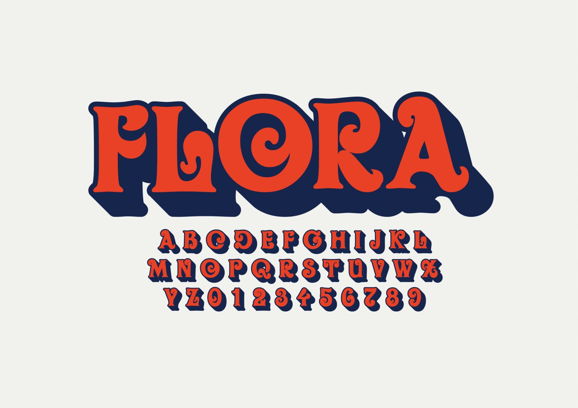
Vector of stylized modern font and alphabet
Experimental typography is often seen as being more creative and innovative than traditional typography, which can be alluring to brands that are constantly trying to differentiate themselves from the competition. However, some brands may be hesitant to add fun and exciting fonts into their branding, worrying that these new typefaces will be difficult to read and thus leading to potential loss of customers. However, when done correctly, this can be an excellent branding strategy and a great way to reinvent your image.
We provide a consultative first meeting without the pressure to sign. Let us know what you’re working on.
Choose Kraus Marketing as Your Branding Agency of Choice
If you’re thinking about using experimental typography for your next marketing campaign, be sure to consult with a professional graphic designer at Kraus Marketing. Our talented team can help you decide the right course of action for your business and ensure your unique typefaces are user-friendly. Contact us today to get started!