Feeling the Impact of Zest Rebranding
The popular soap brand, Zest, was first released in 1955 with the slogan, “For the first time in your life, feel really clean.” A big selling point to back this up was that the Zest soap bar didn’t leave a sticky film behind on the user’s bodies, which was a common problem among other bar soaps. The tagline evolved in the late 1980s to become, “You’re not fully clean unless you’re Zestfully clean!” This new line brought in greater sales and was widely popular in the 1990s, but eventually, other brands caught up. Liquid body wash entered the mainstream, and Zest’s main selling point became irrelevant.
After the brand changed hands, being sold by originator Procter & Gamble and landing at High Ridge Brands, Zest was long overdue for a revamp. It was well-known, but it wasn’t offering anything new or exciting… until this year.
About Us
Full-Service Marketing Agency
We are a full-service digital marketing agency looking to take your campaign or project from concept to finished product, assuring no detail is overlooked along the way.
The Zest rebranding took us through a metamorphosis. It launched an entirely new line of products, offering exotic ingredients, a splash of new color schemes, and gave their brand voice some fervor with sensory-focused messaging. Kraus wants to look at the things we love so much about this rebranding to see how and why it makes it so exciting and new, yet so in line with the classic Zest brand.
Web Design and Color
The Zest website was fully revamped, providing a modern, parallax interface that is flooded with vibrant colors. It’s purposefully chaotic in design, having only a few subpages to give a brief description of the brand and their products, while also having a page to find classic Zest products still in stores.
Capturing relevant information about customers, fans, followers, and friends enable us to create more personalized interactions.
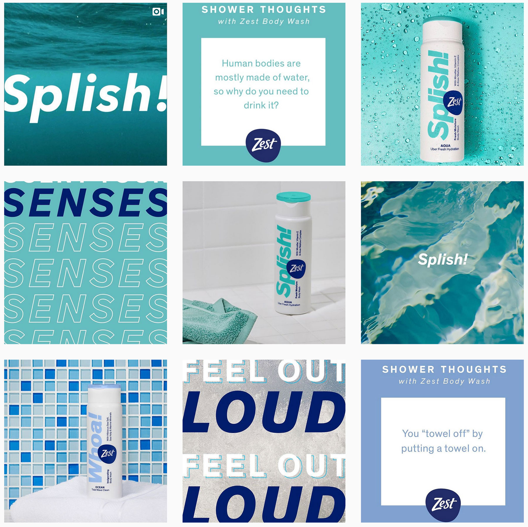
The site almost echoes the 1990’s with bright reds, blues, purples, and pinks in the background, matching their new product packaging. These colors aren’t random, either. They match the new product themes, which leads into…
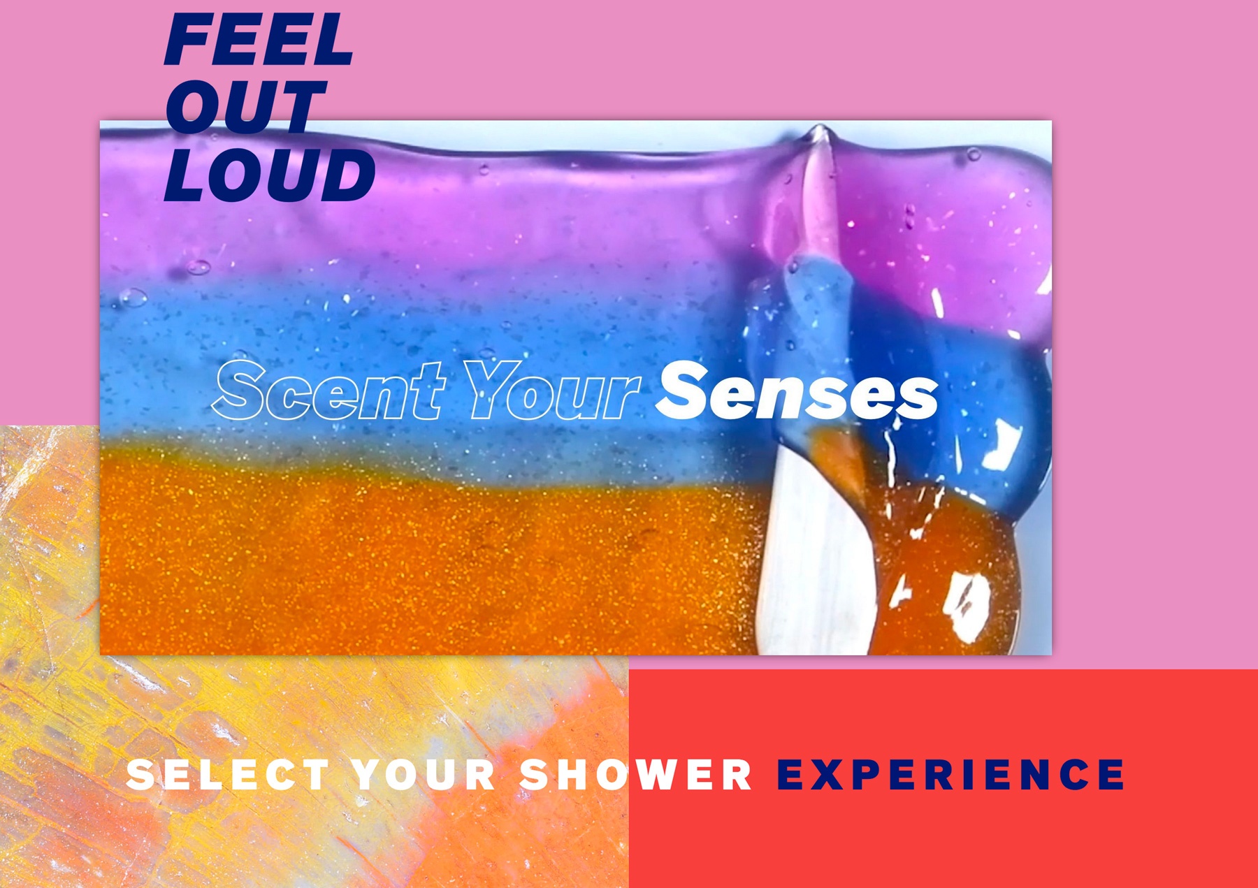
Brand Voice
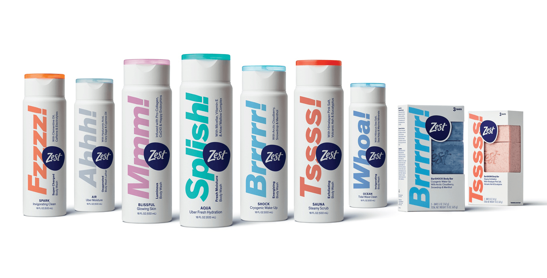
Zest’s copy embodies their new, sensory-focused identity. They use mantras like “Feel Out Loud” and “Scent Your Senses” (which they use consistently throughout their website copy and social media posts). They launched seven new body wash styles, each tingling the senses with the combination of onomatopoeias and environmental signifiers. The new titles include:
Mmm! BLISSFUL
Splish! AQUA
Whoa! OCEAN
Tssss! SAUNA
Brrrrr! SHOCK
Fzzzz! SPARK
Ahh! AIR
These titles elicit sensory information and emotion right off the bat. You read “Tssss! SAUNA” and can feel yourself dipping into a hot tub, hearing the sizzle of the hot water on your skin.
Buzzword Ingredients
The description of the “Tsss! SAUNA” body wash signifies the feeling that Zest is trying to deliver with their new formulations, too: “Leaves skin feeling massaged and revitalized. Formulated with Himalayan Pink Salt, Volcanic Ash and Eucalyptus to help soothe tired muscles. Turns your shower into an oasis with the invigorating aroma of Eucalyptus.”
Everything from the pinkish-red tone to the soothing, descriptive copy alludes to a spa-like showering experience. Not only that, but these new ingredients like Himalayan pink salt and eucalyptus are highly popular with modern consumers searching for more holistic treatments and naturally derived ingredients.
True to Its Refreshing Roots
The Zest rebranding effort also avoids one of the classic blunders (and it’s not entering into a land war in Asia for you Princess Bride fans): They stay true to the brand’s roots. Zest’s brand identity has always contained a splash of water behind their brand logo, and it has pulled in other elements like leaves, cocoa butter, aloe, and pear—all things that shout “Refreshing!” The new products and emphasis on physical sensation stick to that, with water remaining a central point of focus and the goal of refreshing rejuvenation for users’ skin being omnipresent.
Rebranding Like You Never Fell Off
Zest’s rebranding acts as a great case study for a classic brand taking modern consumer trends and using them to their advantage to kick off a new era. With the powerful use of a bright and diverse color palette, a line of new and improved products, and electrifying copy to match, Zest has successfully set their brand up for the new decade without denying or ignoring where they came from.
Kraus Marketing wants to help you rebrand like Zest! Our expert team of copywriters and designers is ready to give your brand the refresh it needs to step boldly into a new era. See our branding portfolio for examples of how we’ve helped brands like yours. If you’re ready to take the leap, contact our office today to get the conversation started!