Branding 101: The Marketing Power of a Logo Evolution
If you’re looking for a way to update your company without a complete rebrand, a simple logo renovation may just be the way to go. A logo represents you visually and says a lot about your company just through the typography, graphical elements, and colors. It also enables consumers to recognize your company across any marketing platform, making a logo updating just as beneficial as a complete rebrand at times.
One of our clients, Team Resources Commercial Real Estate Broker, came to Kraus Marketing with the challenge to redesign their logo, while still including elements from their original one. Take a look at their original logo.

While the structure on the left has leading lines to take you to the name of the company, the name gets lost when next to the structure because of the thin typography. The typeface doesn’t have any strength behind it, so the structure stands out more than the name. The structure’s angle, along with the thin lettering, makes this logo unbalanced, which can reflect negatively on the company. You may have a tough time drawing attention to the brand when advertising if the logo does not pop.
Our goal was to take the original logo and simplify it. We wanted to maintain the recognizable shape of the structure, which represents a warehouse, but make sure that it stood out more than in their original logo. The warehouse came from their focus on industrial and warehouse leasing.
After some revisions, the new logo design looks like this:
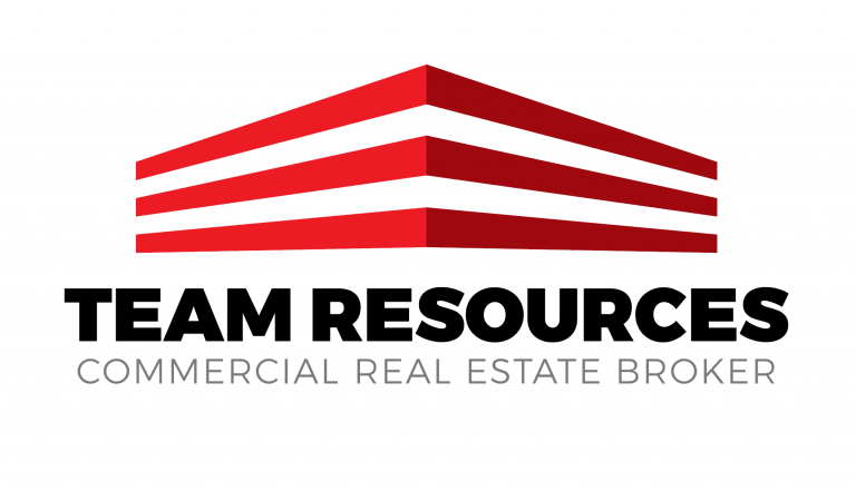 First and foremost, the name of the company now becomes a stand-alone item in the logo, meaning it doesn’t get lost in the design. With the bold lettering that stretches across the structure and the fact that the lettering is below the structure, the tone is brought back to a balanced and grounded. Visual advertising and balance go hand in hand.
The structure also was simplified. We condensed the overall shape by using three spaced out levels instead of five to be more equalized in its proportions. While the grey was removed from the structure, it was added to the bottom of the updated logo to complete the company’s name, which allows consumers to know who they are and what they do.
All the revisions were created with the intention of making the entire logo to be more balanced. The updates now allow the logo to fit comfortable on various mediums including their company website, social media pages, and various print materials used in their marketing campaign.
Do you want to revise some your current branding without doing a full rebrand? Kraus Marketing specializes in a wide variety of branding techniques to best fit your individual business needs. We conduct in-depth interviews to better understand your company and afterwards, our team of creative designers and copywriters work to build a brand that represents you. Contact our team today for more information.