Visual Identity Graphic Design: 3 Elements Your Business Needs
You only have seconds to convince a consumer to not only trust your company, but to consider purchasing your product or using your service. That introduction begins, and can easily end, with a company’s visual branding. Visual identity helps create an emotional impression on viewers and addresses what your brand’s products and services are. It’s the first impression given and is the seed planted in the mind of consumers.
Visual identity graphic design is imperative to a brand. This allows companies to incorporate their own values, services, and identity into a centralized space. Forming logos with strategically chosen colors and aesthetic typography helps speak to a business’s larger story and helps a brand make a more permanent impression.
Brands with strong visual identities can be recognized by certain shapes, shades, and fonts. We’ll break down why those three factors are so important to selling your products and services.

Our Team
Home of the Creatives
At Kraus Marketing we combine great ideas with hard work and a dedicated team of projects managers, designers, web developers, Google certified digital strategeists, and copywriters.
#1 The Impact of Logos
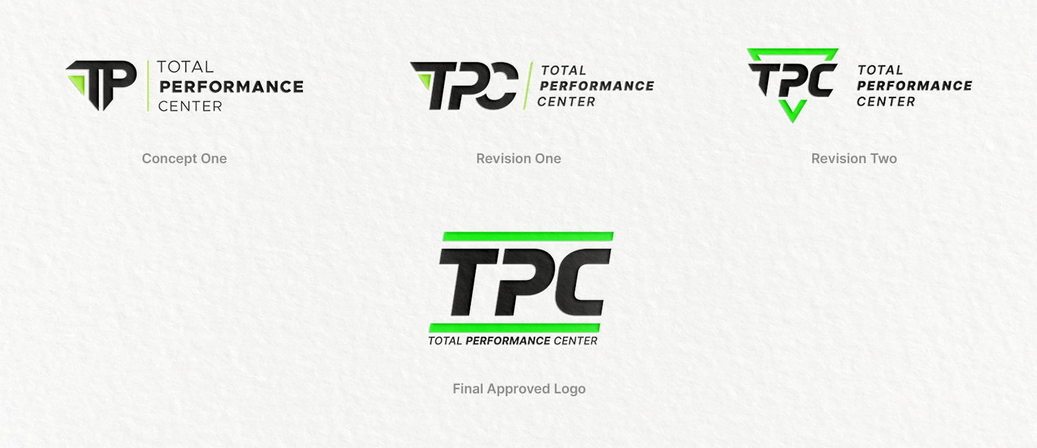
Can you imagine McDonalds without the iconic yellow arches? Or a Nike product without an iconic swoosh? A logo can be as simple as a target for Target, but it is more complicated for non-conglomerates.
Good graphic design will elevate your brand identity. You can utilize creative techniques that not only highlight the best aspects of your business but shine a spotlight on your most valuable services. It makes sense to select a saxophone if you’re a business that only sells saxophones—but that doesn’t have to be the case. Your logo does not always have to imply exactly what your business does.
Kraus can help you create a logo aimed at enhancing your brand in the eyes your target audience. Using emotion-invoking colors and specific typography can also help tie everything together and bring your brand to the next level.

#2 Colors in Visual Identity Graphic Design
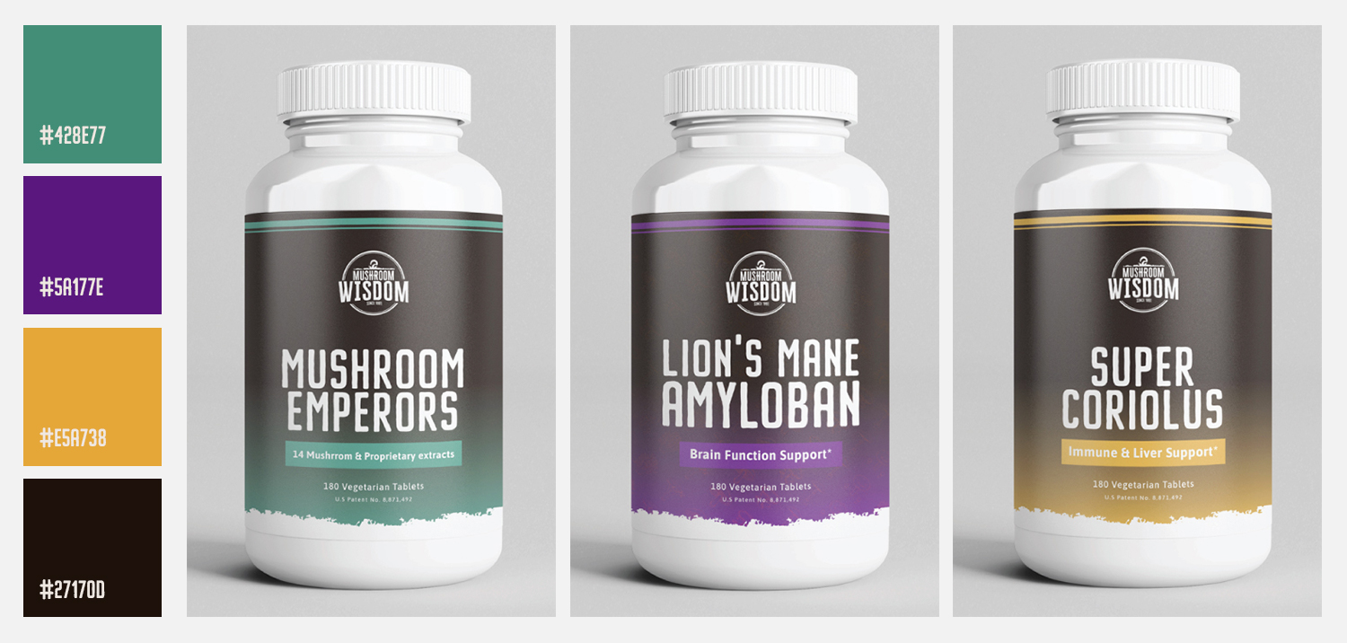
Did you know that some colors are legally trademarked? Specific tones, like Barbie’s pink, UPS’s brown, and Post-it’s canary yellow sticky notes, are owned by companies. These companies have successfully made a color synonymous with their brand—a goal every business should strive for as colors make a strong impact on the consumer. There’s a whole psychology behind it…
A Quick Lesson in Color Psychology
Red – Associated with high visibility, encourages people to make quick decisions, and is the ‘Perfect color for ‘Buy Now’ or ‘Click Here’. Energy and activity is also associated with red.
Blue – A color that brings serenity, wisdom, and trust. As tranquil as the sea or sky, blue can come in many refreshing forms. Interestingly, advertising studies show that blue can suppress appetites, so stay away if you’re a food brand.
Purple – The stability of blue and fire of red clash to make a regal purple. It symbolizes power, luxury, and mystery. Purple can also evoke feelings of nostalgia, which often helps to sell a product.
Green – Representing the natural world and growth, green embodies safety. It can be mixed with other colors to create unique tones (both literally and figuratively):
- Dark green can show greed, jealousy, or ambition.
- Yellowish green can invoke sickness.
- Aqua promises emotional healing and protection.
- Olive green is the traditional color for peace.
Yellow – Known as the color of joy, sunshine, happiness, and kindness. Be careful though, as the wrong shade can go from Dandelion to disaster in a few pixels.
Some colors may seem great in theory, but when pixelated and put to practice, the text clashes with the background. Make sure you use neutrals in your color palette. This includes white, off-white, gray, and black. These shades help make text content stand out, contrasting the creative colors you may select to populate your marketing materials. Try thinking about this color psychology next time you are out shopping!

Check out some of our most eye-catching and campaign driven pieces in our established portfolio.
#3 Text and Typography
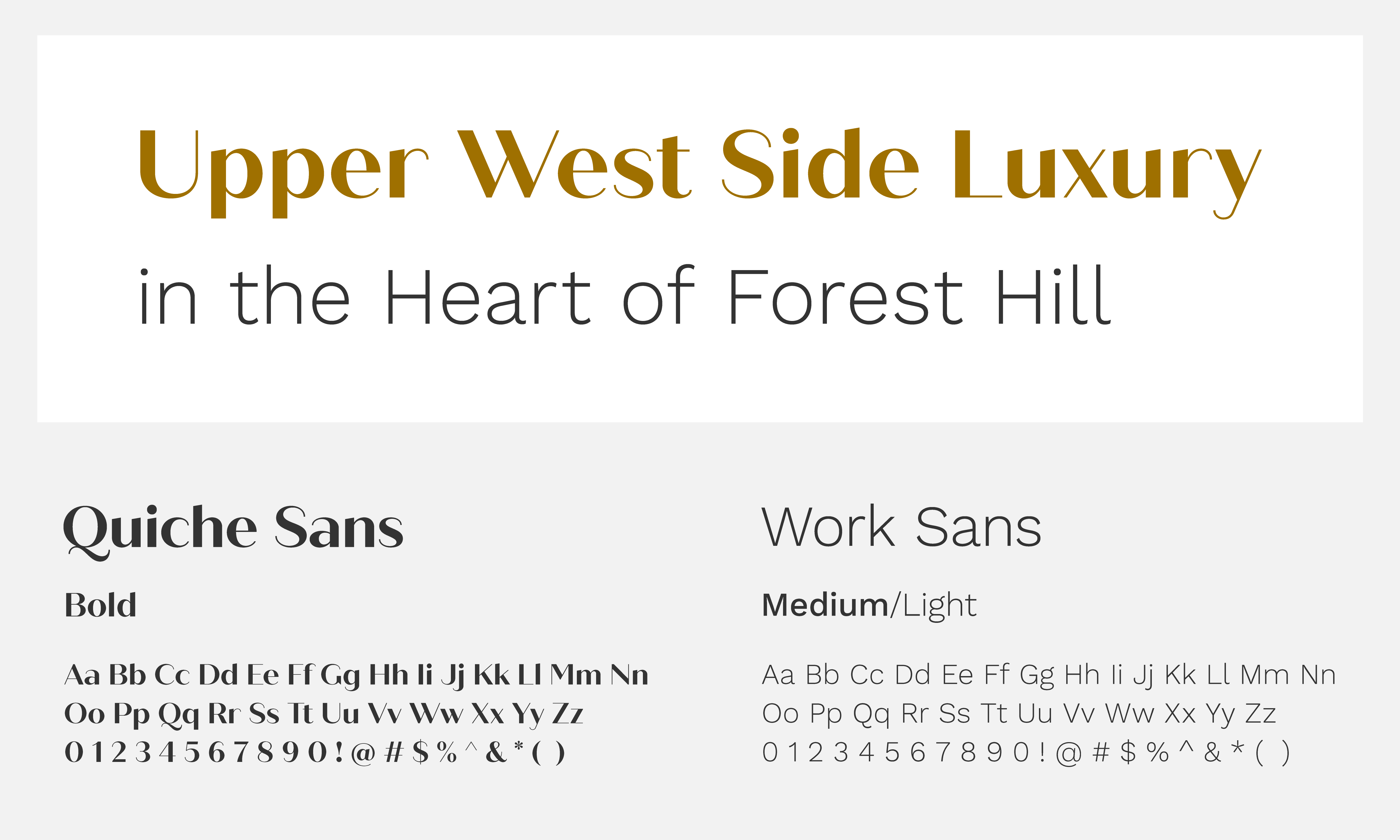
Typography is an essential part of any brand. Consider keeping it quaint with a classic-looking Oswald if you are a mom-and-pop storefront or go bold and expressive with Pacifico to make for an unmissable text in your start-up. We recommend choosing 2-3 font styles when creating your visual identity through text. Each font should have specific guidelines on when to be used and where—for both print and digital mediums.

In the world of design, Kraus Marketing has seen our fair share of incredible typography. We’ve also witnessed how some fonts are overused, tired, and an instant thumbs-down. Stay away from the following fonts:
Fonts Not To Use
Avoid these fonts, as they are considered juvenile and can bring down the reputability of your business: Chalkduster, Courier, Comic Sans, Impact, Papyrus, Curlz
Let Kraus Marketing Advise Your Brand Identity
Kraus factors in your business needs, who your primary audience is, and how they prefer to interact with your brand to help grow your business accordingly. We can find you the right mix of logo design, color palette, and typography to build your brand anew. Reach out to the experts here at Kraus to discuss finding your new visual brand identity.

