GoDaddy’s Rebrand Includes a Shift into the Modern Age
GoDaddy, the webhosting company and domain registrar, has recently unveiled a redesign of their company marketing. Complete with a brand-new logo, the GoDaddy rebrand made some major changes to their classic website. Keep reading to find out what changed and why!
New logo
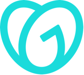
One of the biggest parts of GoDaddy’s redesign is their brand-new logo. Though it may not be immediately obvious what the logo actually is—it somewhat resembles a pair of flipflops—GoDaddy describes it as a combination of the word GO and a heart. The intent of this new logo is to be “a symbol of empowerment” for entrepreneurs, representing spirit, joy, and humanity. GoDaddy released a statement with the logo explaining that features of the new design, such as the open center and overlapping arcs, are meant to visually represent their new dedication to diversity and supporting entrepreneurs of every stripe.
This represents a strategic departure from marketing decisions of the past, which include GoDaddy’s history of infamously inappropriate advertising. Although it may take some time, replacing their old cartoon “guy” logo from that period and publicly doubling down on their commitment to diversity is helping move the company away from the image-problems of the past and into a brighter future. Overall, regardless of how you feel about the logo as a symbol of empowerment, the new GO is definitely a fresh look for the company.


Logo Design
Make Your Brand Front-of-Mind
Your logo delivers the promise of quality and value that your company has established. Whether you are a new company yet to develop a logo or an existing one in need of something new, Kraus has you covered.
New color palette
Another change in the GoDaddy rebrand is their bright new color palette. Gone are the days of the classic GoDaddy Green—for a more modern look, the website has shifted to a new palette of bright and bold new colors. A dark purple, mustard yellow, and deep teal all make statements on different pages of the website, but the biggest—and brightest—color of the new palette is an eye-popping aqua. It’s found in the company’s name and logo and is used as the only color highlight in a series of doodle-style animations found throughout the website. Although less recognizable than their classic green, the aqua is certainly more eye-catching and better suited for the updated look GoDaddy seems to be aiming for, and is supported by the bold color choices throughout the rest of the website.

Check out some of our most eye-catching and campaign driven pieces in our established portfolio.
New art and animation
The other big change in the GoDaddy rebrand is the new embracing of art and animation on the GoDaddy website. The redesign involves several types of new art, including color-blocked photography, doodle-style animations, and 3-D art and graphics. All the art focuses on colorful and whimsical appeal, which makes the new website seem younger and more fun than its predecessor. Using both doodle-style and 3-D art creates an interesting visual contrast across different pages of the website, and the decision to use both art and animation keeps all the content engaging. This is likely a move on GoDaddy’s part to keep up with competition that creates business by following trends to appeal to a creative, entrepreneurial crowd. Although having all these different styles of art side by side can feel a little overwhelming at times, it definitely makes GoDaddy stand out as a modern webhost that can appeal to trend-conscious entrepreneurs.
Overall, GoDaddy’s rebrand has focused on updating and innovating their site, with a new logo, new color palette, and new art to match. Although it left behind some classic GoDaddy design choices, the new design is aimed at keeping up with competition and capturing a fresh market. Only time will tell if GoDaddy’s new rebrand finds success, but for now enjoy their new look and keep an eye out for what they do next.
Ready for a change? Whether you want to shake things up or just update your look, let the creative team at Kraus Marketing help you with the rebrand of your dreams. Contact us today!

